Rainbow Magic Music Education
Web Design | Conceptual Design | Graphic Design
Rainbow Magic Music Education was the first IT project I completed individually during my IT degree. This project was to assist us in developing an understanding of web design - from UX design and UI design to navigating coding languages - and begin our journey as IT professionals.
The Project
The Project Brief: Create an educational website by using a children’s novel as inspiration.
We were given a very broad brief that allowed us the chance to explore and create a website that we were invested in the development and implementation of. As an individual project, we weren’t bound by other team-mates opinions, and therefore, I found that there was alot more flexibility on creativity and imagination - which was vital for an introductory course.
Discovery & Define
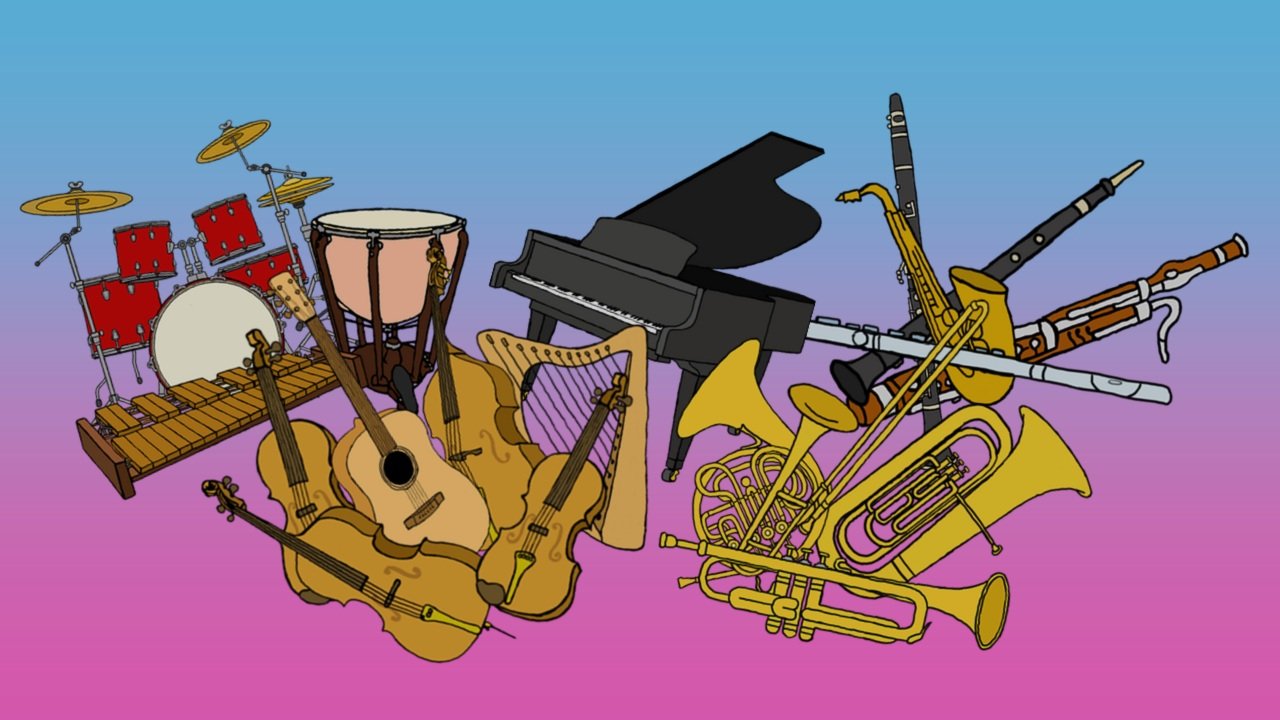
I determined that this website would educate children on music theory and general classroom music. Some content would include the instruments of the orchestra and general information on music and sound.
The chosen story to pair alongside this content was the Rainbow Magic book series by Daisy Meadows. This series provides ample opportunity for intertwining the educational content with the characters from the novels, as there is a series of music fairies. These fairies can then be the ‘teachers’ and also help ‘guide’ through the website.

These are the music fairies from the ‘Rainbow Magic’ series. These will not only be important characters for user guidance, but the aesthetics of the books will directly influence the final website aesthetics as well - with any extra imagery matching the hand-drawn stylisation.
From these decisions, I could then define the target audience and stakeholders that would greatly influence how the website would be designed. The primary target demographic is young children, aged 4-12, who have an interest in music and/or fairies. They’ll use this website during classroom music lessons or at home to further their knowledge. A secondary user group that should be considered is music teachers and parents who are encouraging students to use the site.
To understand the user groups more, I created various personas of both Primary and Secondary users, which helped explore how they might navigate the website for their different needs.


Site Mapping & Paper Prototype
To determine the visual organisation and functionality of the website, I prepared some different testing sessions. The first was card sorting; to understand how different users would expect topics and content to be organised on the site. The cards included instruments, the fairies, the instrument sections, and various music theory terms. By conducting an open sort, where the users were provided with the freedom to decide how best to sort content - this provided varying results. Some users sorted the instruments into modern/rock music and classical/orchestral. Another user conglomerated all instruments under one heading of the orchestra, which was considerably large.


From these results is clear that users might struggle to locate specific instruments or terms without guidance, especially those who are in the process of learning the orchestra. To solve this issue, incorporating various visual cues, such as including images of the specific instruments within each section, would assist the users in finding their chosen topic.
The educational content would therefore be sorted into ‘The Orchestra’ and ‘Music Theory’ with clear subcategories of instrument sections and music terminology - as seen in the determined site map.

The second testing session was paper prototyping. The paper prototyping session aimed to gain a better understanding of how users might interact with the site and navigate the visual space. The users were asked to complete five tasks of varying difficulties. Depending on how the user interacted with the paper, I (as the ‘computer’) would react and change the elements of the page.
One reoccurring feature that was included in user feedback was that there was a lack of labelling on certain elements of the website, such as names of specific instruments, meaning that the user had to guess what instrument they needed. There was also a need for easier navigation back to previous pages, as well as clearer main navigation. However, they enjoyed the content and the main organisation of the website and its many elements. A major change that came from these sessions was to move the pop-up rainbow menu to a fixed global heading.


Functionality and Wireframing
From the various prototyping activities, it was vital to properly prepare the structure of the website for easier implementation of the HTML content. The website was likely to have to incorporate many visual stimuli for the target audience to engage with, including the fairies and instruments, therefore the balance between text and images needed to be organised and purposeful.
From the site map developed I was able to design a more thorough structure for the user interface to determine how users navigate between instruments and music theory. The fixed global navigation at the heading of the page allows for easy user interaction so they can return to a previous main page or navigate to new pages. I chose to utilise Melodie the Music Fairy and the leading teacher for the website. This allowed me to use Melodie as the narrator to assist students in navigating what they’re meant to do on each page, eg. “What would you like to learn about?” or “Pick an instrument to learn more” Both prompt the users to interact further with the website. To assist in user navigation, including breadcrumb trails of links to previous pages, eg. “back to orchestra” when on the Strings page, allows users to easily move between sections of the orchestra.
Here are some of the wireframes I created. Each instrument is now clearly labelled with their name for easier visual comprehension.

The instrument page also incorporates an interactive element for greater user engagement.

I created a storyboard of persona scenario, where Jasmine is more curious to learn about the music fairies. She is welcomed by Melodie and prompted to move to the main page, where she is then prompted to pick between Orchestra, Music Theory, or the Music Fairies. Based on the images for each option, she recognises that the fairies are one of the pages and picks that button. The fairies page is covered in the different music fairies and Jasmine is prompted to “pick a fairy to learn more!" where she then clicks on one. This produces a message from Fiona the Flute Fairy, who tells us about herself and what instruments she plays. From this user journey, Jasmine was able to navigate to her preferred subject and discover more about the music fairies as she intended.

The Aesthetics
As the Rainbow Magic Fairy books were to be utilised as the main aesthetic influence for this website, I had to create many extra design assets to keep the visual aesthetic cohesive. Based on the existing designs of the instruments the fairies held I had to create the rest of the orchestra with a similar stylisation. To do so, I digitally sketched the instruments in Adobe Photoshop. To match the hand-drawn aesthetic of the instruments, I also created extra digital assets of the various music clefs that would be utilised on the instrument pages.


I also had to mask the different music fairies from the front covers of their books to create transparent images, once again done in Photoshop. I also created Harmony the Horn Fairy using Adele the Voice Fairy and making her hold a French Horn, as previously none of the fairies were within the horn section of the orchestra.

The main typography of the website should be readable for the younger audience whilst still having a sense of wonder and ‘magic’ in the details. Using a blue and pink gradient as the background would create a flying effect and keep a consistency between the accent pink used in the logo of the books. These two colours were then used throughout the website as accents and hover effects, with black and white fonts being used to contrast against the colours, assisting users in readability. The rainbow used in the logo was also used as the primary navigation bar background, with the links having a cloud background, to aesthetically match the logo.
Website Implementation
Due to time constraints, I had to scrap the music theory page from the site map as the Photoshop, content creation and page coding were too time-consuming and would deter the final result of the site. However, instead, I created a functional quiz page that utilises JavaScript for validation to provide feedback on user answers. I also included other JavaScript elements, such as sounds playing when hovering over various buttons or having sounds play after user interaction (pressing a button). The final JavaScript implementation was a jQuery plugin for a cursor sparkle trail, to add an extra level of magical interactivity for users.


Overall, the website functions as intended with users able to navigate between various instruments and orchestral sections to learn more about their chosen interest. Each instrument page has a description of the instrument, their preferred clefs and an interactive feature - a link to an example of the instrument in use, the different strings of the instrument, different varieties of the instrument etc.


If more time was permitted, I would’ve loved to have incorporated the music theory section of the website. I also would spend more time refining and polishing to make the site even more approachable and aesthetically pleasing - as there are some code hiccups. I’d also continue to work on progressive enhancement and incorporate more technical elements and make it more responsive friendly for mobile usage.


In saying that, I am immensely proud of the product I produced considering it to be an individual assessment piece that I created in a short timeframe. This was also my first individual coding project at university, so it was a big learning curve - especially the JavaScript, which I’d never adventured with during school.